Overview

  • Project Type: Product Design
  • Timeline: 9 months
  • Platform: Figma
  • Role: Product Designer (solo)

Outcome Brief

Results from usability testing showed the following major issues:

    • Guests struggled with booking tours without an account.
    • 60% of users struggled to get a confirmation code.
    • 60% of users struggled to read the text


To resolve these issues, the redesign did the following:

    • Use high contrast and icons to facilitate low visibility
    • Increase the text size and simplify the design
    • Decrease page transitio ns and reduce click rate
    • Remove the need for logging in
    • and more....


Problem Statement

The Hive Galleria is growing by giving scheduled tours. Now they are struggling to get all their tour clients checked in at the same time. Clients have given them bad feedback and reviews about how long they have to wait to get checked in.
Goals

  • Streamline the check-in process for scheduled tour clients to reduce wait times
  • Improve the overall client experience and reduce negative feedback related to delays
  • Design an intuitive, mobile-friendly interface for efficient on-site check-in

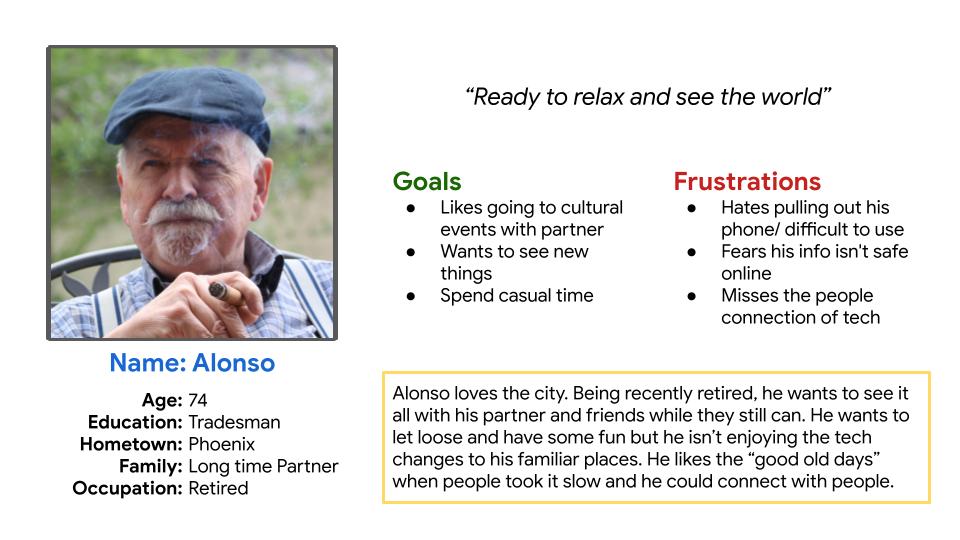
Participants

  • 4 participants
  • Ages 19-50
  • Users had mixed experiance from
  • Focus on mobile-first users

Methodology

  • Used screening and essay surveys to gather initial user insights
  • Conducted moderated usability testing (Zoom + in-person)
  • Collected screen/audio recordings and session notes
  • Transferred data to Google Docs and Sheets for analysis

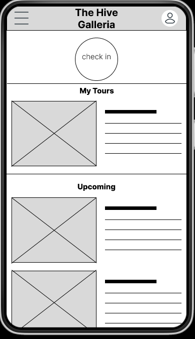
Initial designs

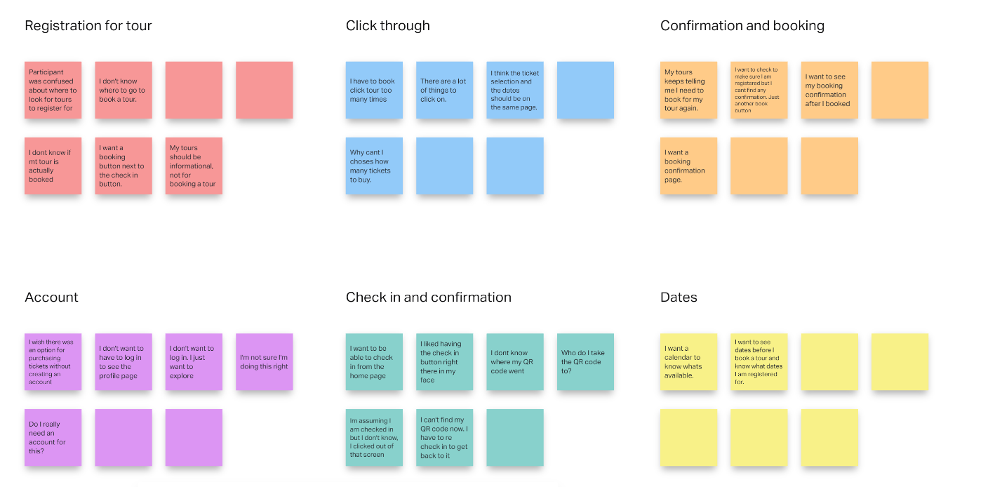
  • Affinity Maps
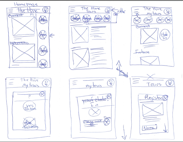
  • Wireframes
  • First Mock-ups

Key Findings

Findings from the first rounds of usability testing suggested that these designs needed improvements, mostly in the context of accessibility and visual cues. The following findings came from both the first and second rounds of testing.

  1. Guests Want an option to register for a tour without creating an account
  2. Most users struggled to find a tour to register for
  3. Most users struggled to get a confirmation code
  4. Guests want to be able to see the text better
  5. Some guests struggled to read the text at all
  6. Most users felt the design wasn’t aesthetically pleasing

Recommendations

  • Use high contrast and icons to facilitate low visibility
  • Increase the text size and simplify the design
  • Decrease page transitions and reduce click rate
  • Remove the need for logging in
  • Change the user flow to better show where expected tours would be
  • Change the color pallet both for accessibility and aesthetics

Prototyping

Prototyping had to be started from scratch with each iteration as the user flow changed from Design A, and Design B to the final Design.

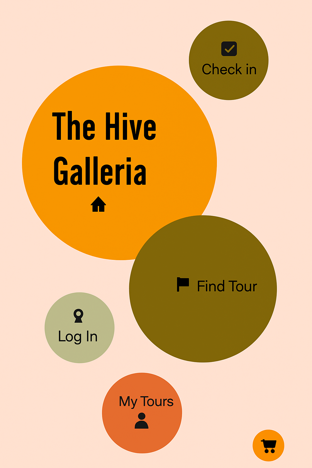
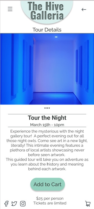
Final designs

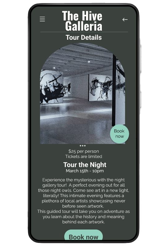
The finished Design iterations showed improvements during subsequent rounds of testing. Accessibility improved dramatically.

Reflection

This project has greatly improved the usability of this app throughout development. According to an anonymous user “Great use of navigation !”. This app would streamline the registration and check in process for an art gallery.


This project pushed the personal boundaries of design as well as meeting the challenges presented by the usability studies. I feel these lessons have rapidly developed my skills for future projects. If I had to do it all over again I would change the initial color pallet to be even more accessible. I would create a softer feel with more motion design. I would change the flow of the app to better meet the needs of the user with innovative processes that do not require log in’s and personal accounts.

Up next...

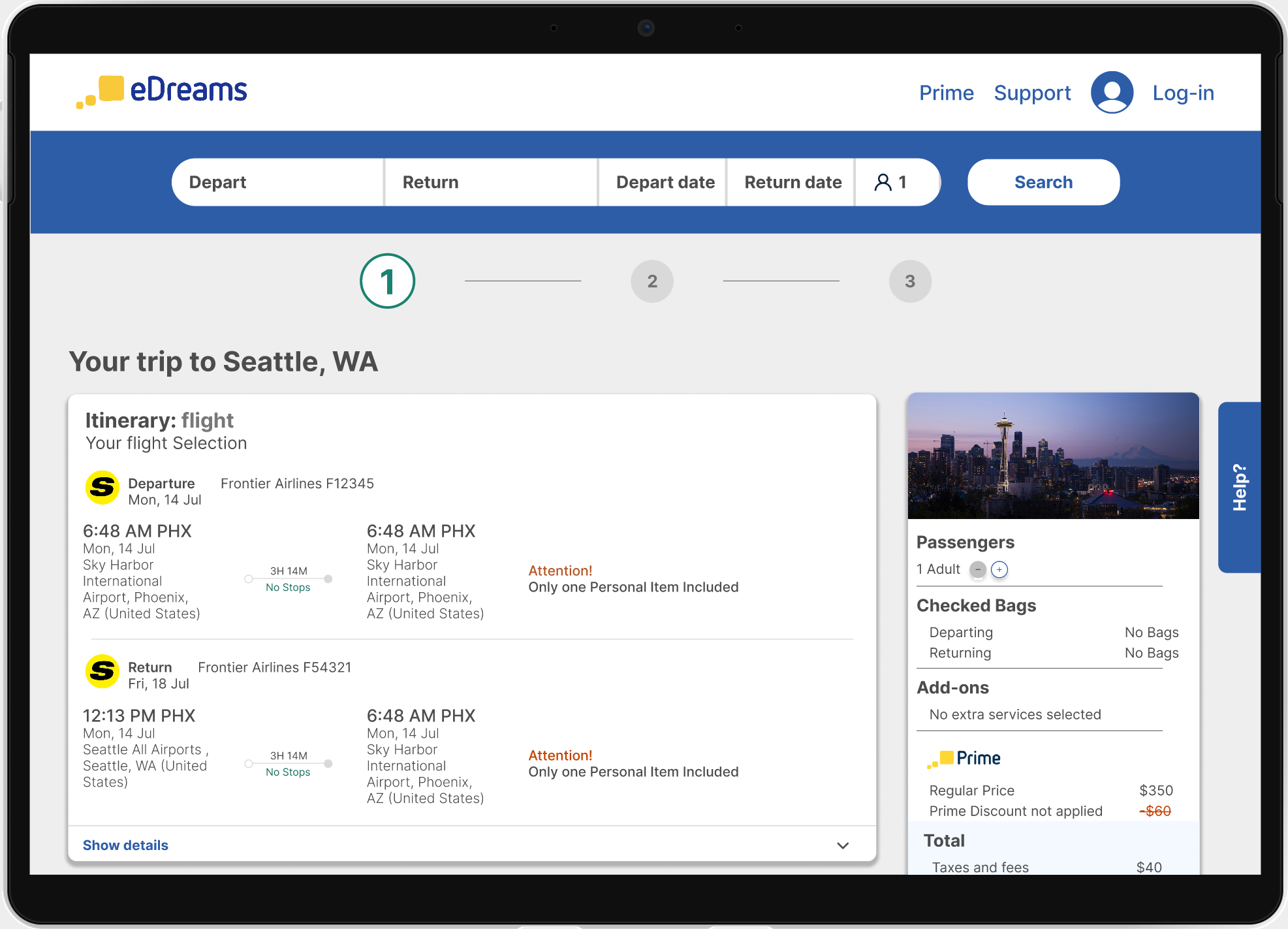
Case Study: eDreams Usability Study (2025)

Next

Chandra Carr

Let’s work together

Overview

  • Project Type: Product Design
  • Timeline: 9 months
  • Platform: Figma
  • Role: Product Designer (solo)

Outcome Brief

Results from usability testing showed the following major issues:

    • Guests struggled with booking tours without an account.
    • 60% of users struggled to get a confirmation code.
    • 60% of users struggled to read the text


To resolve these issues, the redesign did the following:

    • Use high contrast and icons to facilitate low visibility
    • Increase the text size and simplify the design
    • Decrease page transitions and reduce click rate
    • Remove the need for logging in
    • and more....

Problem Statement

The Hive Galleria is growing by giving scheduled tours. Now they are struggling to get all their tour clients checked in at the same time. Clients have given them bad feedback and reviews about how long they have to wait to get checked in.
Goals

  • Streamline the check-in process for scheduled tour clients to reduce wait times
  • Improve the overall client experience and reduce negative feedback related to delays
  • Design an intuitive, mobile-friendly interface for efficient on-site check-in

Participants

  • 4 participants
  • Ages 19-50
  • Users had mixed experiance from
  • Focus on mobile-first users

Methodology

  • Used screening and essay surveys to gather initial user insights
  • Conducted moderated usability testing (Zoom + in-person)
  • Collected screen/audio recordings and session notes
  • Transferred data to Google Docs and Sheets for analysis

Initial designs

  • Affinity Maos
  • Wireframes
  • First Mock-ups

Key Findings

Findings from the first rounds of usability testing suggested that these designs needed improvements, mostly in the context of accessibility and visual cues. The following findings came from both the first and second rounds of testing.

  1. Guests Want an option to register for a tour without creating an account
  2. Most users struggled to find a tour to register for
  3. Most users struggled to get a confirmation code
  4. Guests want to be able to see the text better
  5. Some guests struggled to read the text at all
  6. Most users felt the design wasn’t aesthetically pleasing

Recommendations

  • Use high contrast and icons to facilitate low visibility
  • Increase the text size and simplify the design
  • Decrease page transitions and reduce click rate
  • Remove the need for logging in
  • Change the user flow to better show where expected tours would be
  • Change the color pallet both for accessibility and aesthetics

Prototyping

Prototyping had to be started from scratch with each iteration as the user flow changed from Design A, and Design B to the final Design.

Final designs

The finished Design iterations showed improvements during subsequent rounds of testing. Accessibility improved dramatically.

Reflection

This project has greatly improved the usability of this app throughout development. According to an anonymous user “Great use of navigation !”. This app would streamline the registration and check in process for an art gallery.


This project pushed the personal boundaries of design as well as meeting the challenges presented by the usability studies. I feel these lessons have rapidly developed my skills for future projects. If I had to do it all over again I would change the initial color pallet to be even more accessible. I would create a softer feel with more motion design. I would change the flow of the app to better meet the needs of the user with innovative processes that do not require log in’s and personal accounts.

Up next...

Case Study: eDreams Usability Study (2025)

Next

Chandra Carr

Let’s work together

Overview

  • Project Type: Product Design
  • Timeline: 9 months
  • Platform: Figma
  • Role: Product Designer (solo)

Outcome Brief

Results from usability testing showed the following major issues:

    • Guests struggled with booking tours without an account.
    • 60% of users struggled to get a confirmation code.
    • 60% of users struggled to read the text


To resolve these issues, the redesign did the following:

    • Use high contrast and icons to facilitate low visibility
    • Increase the text size and simplify the design
    • Decrease page transitions and reduce click rate
    • Remove the need for logging in
    • and more....

Problem Statement

The Hive Galleria is growing by giving scheduled tours. Now they are struggling to get all their tour clients checked in at the same time. Clients have given them bad feedback and reviews about how long they have to wait to get checked in.
Goals

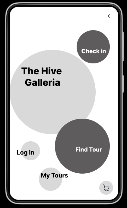
  • Streamline the check-in process for scheduled tour clients to reduce wait times
  • Improve the overall client experience and reduce negative feedback related to delays
  • Design an intuitive, mobile-friendly interface for efficient on-site check-in

Participants

  • 3 participants
  • Ages 18-70
  • Users had mixed experience of technical knowledge

Methodology

  • Used screening and essay surveys to gather initial user insights
  • Conducted moderated usability testing (Zoom + in-person)
  • Collected screen/audio recordings and session notes
  • Transferred data to Google Docs and Sheets for analysis

Initial designs

Affinity maps

Wireframes

First Mock-ups

Key Findings

Findings from the first rounds of usability testing suggested that these designs needed improvements, mostly in the context of accessibility and visual cues. The following findings came from both the first and second rounds of testing.

  1. Guests Want an option to register for a tour without creating an account
  2. Most users struggled to find a tour to register for
  3. Most users struggled to get a confirmation code
  4. Guests want to be able to see the text better
  5. Some guests struggled to read the text at all
  6. Most users felt the design wasn’t aesthetically pleasing

Recommendations

  • Use high contrast and icons to facilitate low visibility
  • Increase the text size and simplify the design
  • Decrease page transitions and reduce click rate
  • Remove the need for logging in
  • Change the user flow to better show where expected tours would be
  • Change the color pallet both for accessibility and aesthetics

Prototyping

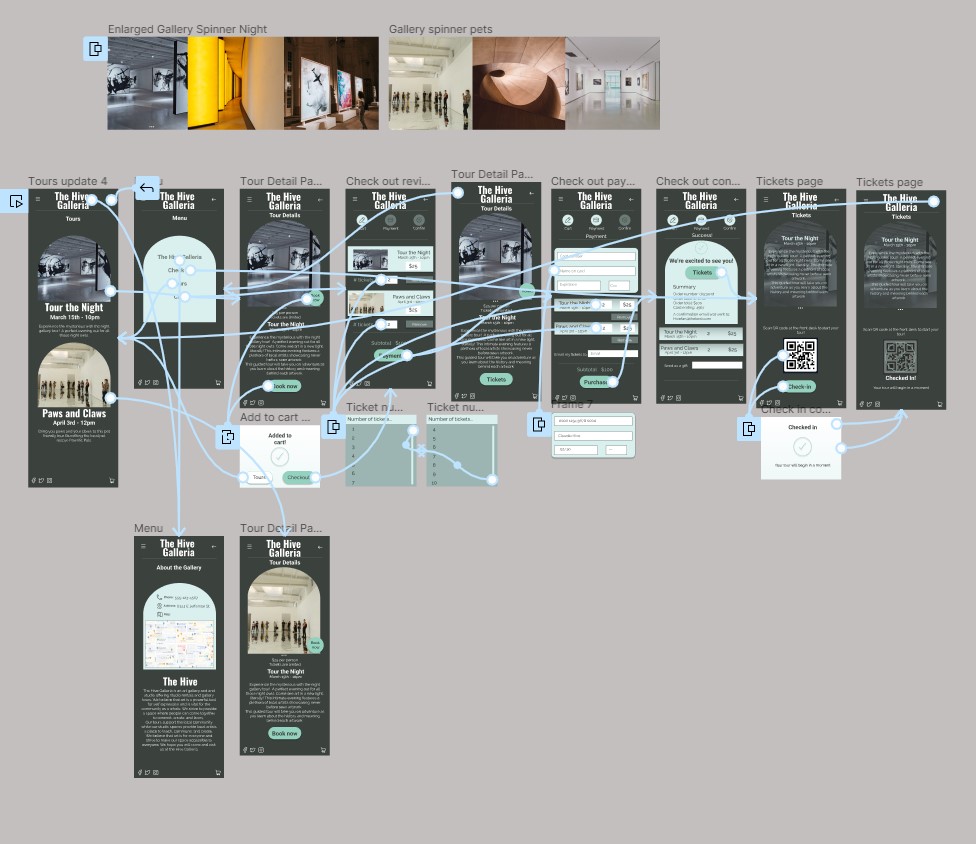
Prototyping had to be started from scratch with each iteration as the user flow changed from Design A, and Design B to the final Design.
Final designs

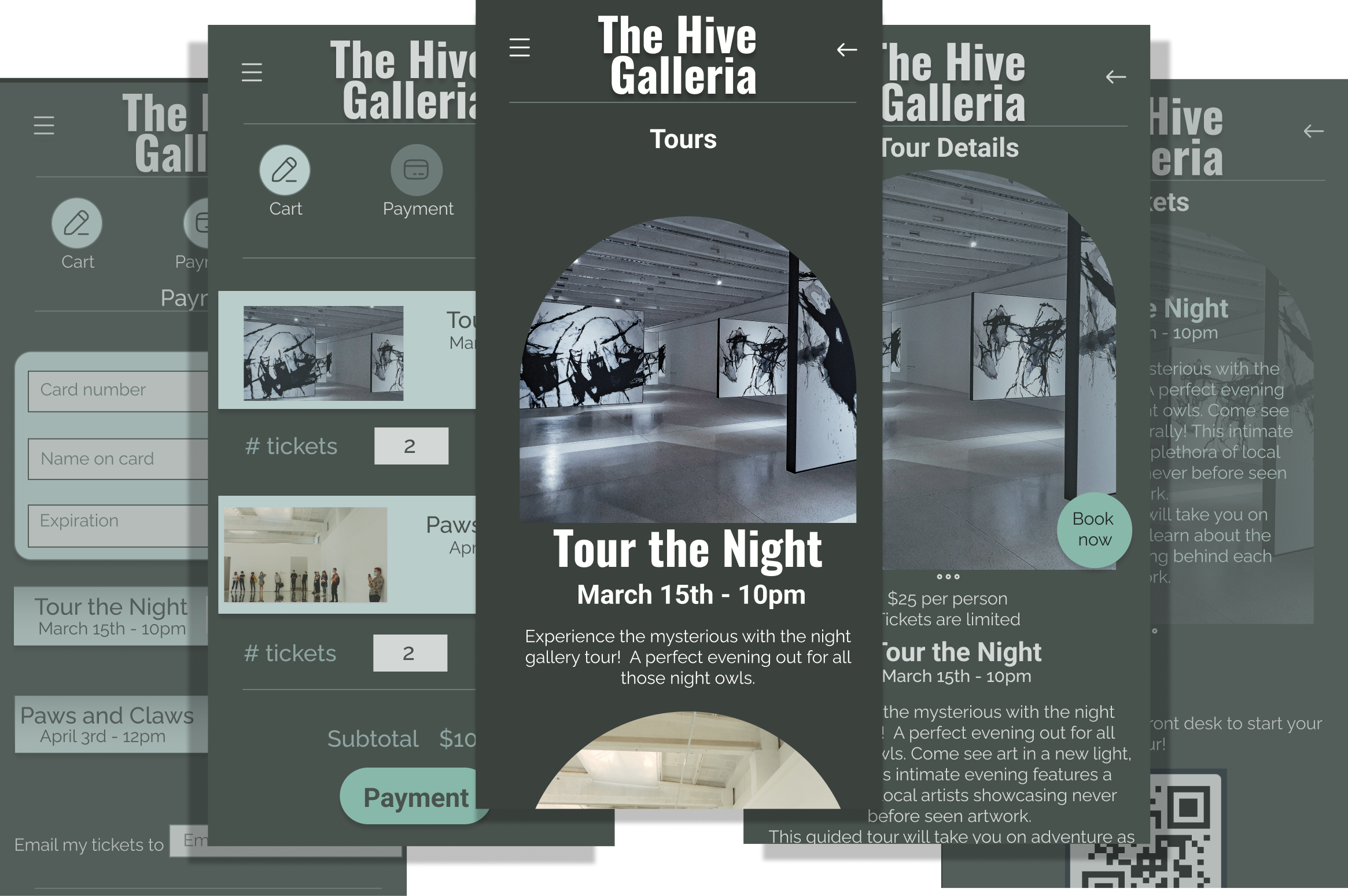
The finished Design iterations showed improvements during subsequent rounds of testing. Accessibility improved dramatically.
Reflection

This project has greatly improved the usability of this app throughout development. According to an anonymous user “Great use of navigation !”. This app would streamline the registration and check in process for an art gallery.


This project pushed the personal boundaries of design as well as meeting the challenges presented by the usability studies. I feel these lessons have rapidly developed my skills for future projects. If I had to do it all over again I would change the initial color pallet to be even more accessible. I would create a softer feel with more motion design. I would change the flow of the app to better meet the needs of the user with innovative processes that do not require log in’s and personal accounts.

Up next...

Case Study: eDreams Usability Study (2025)

Next