Case Study: eDreams Usability Study (2025)
Results from testing showed the following major issues:
To resolve these issues, the redesign did the following:
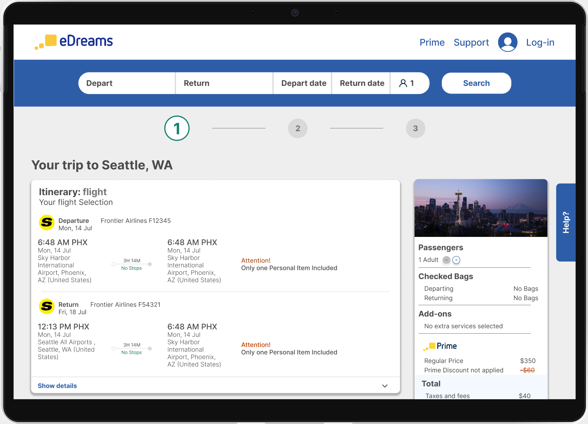
Users were struggling to complete flight bookings on the eDreams mobile site due to confusing navigation, vague error messages, and unclear summary details.
Users clicked on the blue “discount price” without realizing they were signing up for a subscription
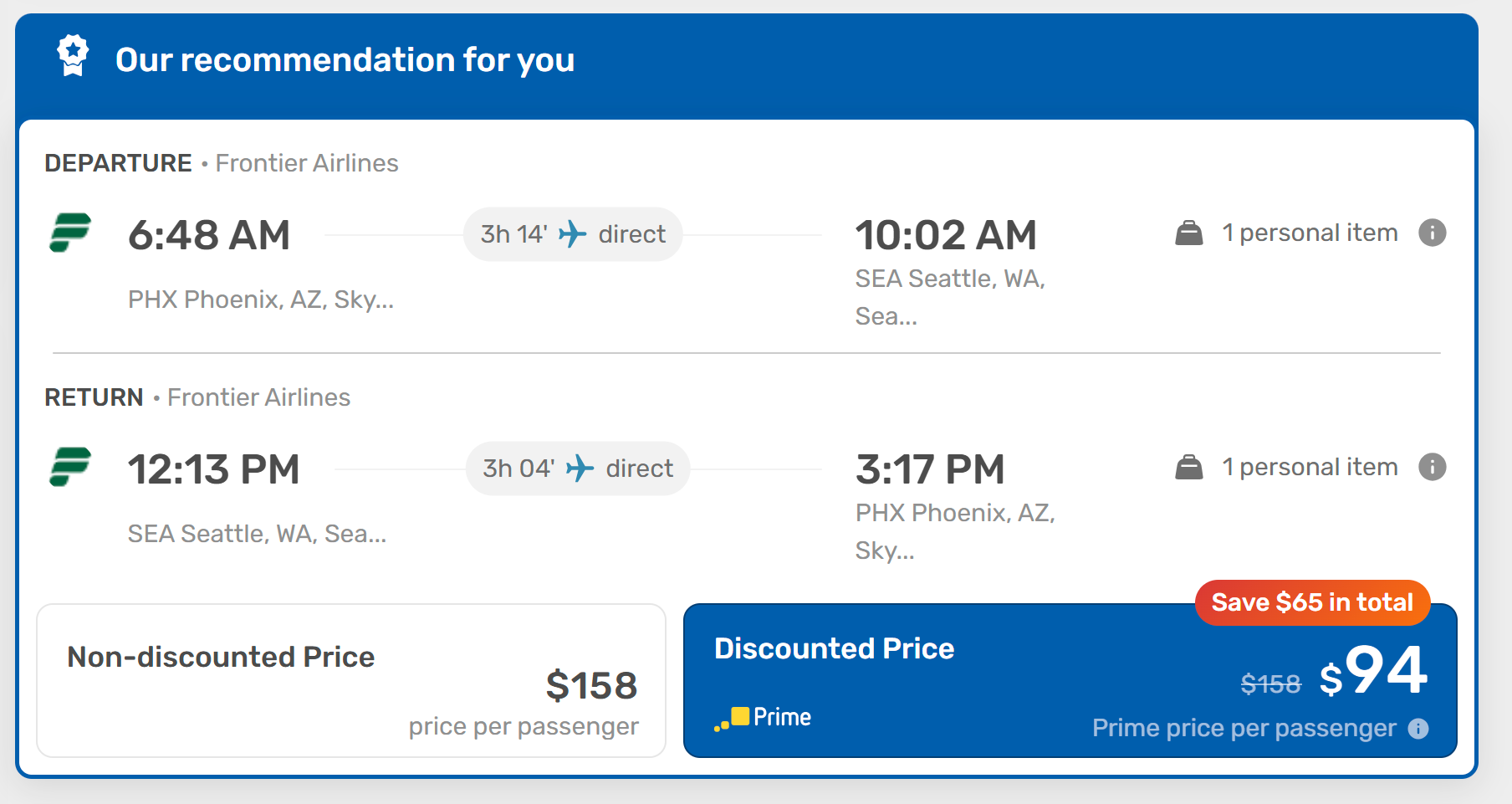
Clarify and Condense Pricing Structure:
Reduce Add-On Complexity:
Improve Navigation & System Feedback:
Enhance Accessibility & Visual Design:
Streamline Information Architecture:
The updated progress bar helps users know where they are in the process. The header is also updated with helpful and consistant navagation that follows the user from page to page to create trust.
This study highlighted the critical role of transparency in building user trust, especially around pricing. Small design issues—like unclear labels or poor contrast—can create significant barriers and anxiety. Simplifying content, aligning with user expectations, and applying ethical design principles helped reduce cognitive load and frustration. Adapting designs mid-process reinforced the need for flexibility and early testing to prioritize user clarity, trust, and agency.
Unpacking Complexity: A Human Factors Usability Study (2025)
Next

Results from testing showed the following major issues:
To resolve these issues, the redesign did the following:
Users were struggling to complete flight bookings on the eDreams mobile site due to confusing navigation, vague error messages, and unclear summary details.
Users clicked on the blue “discount price” without realizing they were signing up for a subscription
Clarify and Condense Pricing Structure:
Reduce Add-On Complexity:
Improve Navigation & System Feedback:
Enhance Accessibility & Visual Design:
Streamline Information Architecture:
The updated progress bar helps users know where they are in the process. The header is also updated with helpful and consistant navagation that follows the user from page to page to create trust.
This study highlighted the critical role of transparency in building user trust, especially around pricing. Small design issues—like unclear labels or poor contrast—can create significant barriers and anxiety. Simplifying content, aligning with user expectations, and applying ethical design principles helped reduce cognitive load and frustration. Adapting designs mid-process reinforced the need for flexibility and early testing to prioritize user clarity, trust, and agency.
Unpacking Complexity: A Human Factors Usability Study (2025)
Next
Results from testing showed the following major issues:
To resolve these issues, the redesign did the following:
Users were struggling to complete flight bookings on the eDreams mobile site due to confusing navigation, vague error messages, and unclear summary details.
Users clicked on the blue “discount price” without realizing they were signing up for a subscription
Clarify and Condense Pricing Structure:
Reduce Add-On Complexity:
Improve Navigation & System Feedback:
Enhance Accessibility & Visual Design:
Streamline Information Architecture:
The updated progress bar helps users know where they are in the process. The header is also updated with helpful and consistent navigation that follows the user from page to page to create trust.
During high-fidelity mockups, the original card format for add-ons was preserved to fit content constraints, deviating from wireframe plans.
The simplified add-on card and bundle layout were re-integrated due to spacing and clarity concerns.
Several non-essential elements (e.g., auto-expanded flight details, banner ads) were removed or collapsed to reduce cognitive load. These may be revisited in a future iteration.
This study highlighted the critical role of transparency in building user trust, especially around pricing. Small design issues—like unclear labels or poor contrast—can create significant barriers and anxiety. Simplifying content, aligning with user expectations, and applying ethical design principles helped reduce cognitive load and frustration. Adapting designs mid-process reinforced the need for flexibility and early testing to prioritize user clarity, trust, and agency.
Next